
Tracking the flu on Twitter
Using Twitter to Monitor Epidemics

Updated 1/22/13
I will no longer update this webpage or the map therein. Over the next 3 months I will migrate all data into a flowing, interactive map/webpage. I submit this static page as a proof of concept.The core of my thesis research at the University of Wisconsin-Madison is focused on gathering data from Twitter in order to better understand social phenomena geographically. The micro-blogging service Twitter is a social media platform that allows users to share opinions, links, and images in 140 or fewer characters. There are a variety of privacy settings involved with all social media platforms. One option that Twitter allows is the ability of users to display their Tweet Location .
Common to most new technologies in the social web is an application programing interface (API) that gives developers access to a portion of their social graph. Twitter's streaming API allows developers to pull in about 1% of the full 400 million tweets a day stream. Approximately 3 to 5% of all Twitter users have opted to share their geolocation, and it is these messages that I am interested in exploring. What kind of spatial knowledge can be gained from this service and how can we apply it to everyday knowledge discovery? One example application that I am actively developing is a flu tracker.
My methodology and source code follows below. I intend to update the frequency tracker daily and the map once a week. In the next couple of months I will transition this application into an interactive, streaming website.
Daily Twitter Illness Frequency Tracker
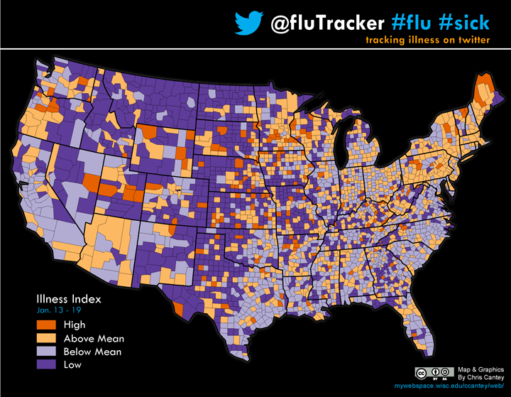
Weekly Flu Tracker Maps:
I have plotted all the tweets (1-2 million per day) received from my crawler using ArcGIS. I then count the number of "sick" tweets and total tweets per county using the "countpntsinpolys" method from spatialecology.com and add those fields to the county dataset.
To create the choropleth Illness Index in ArcGIS I normalize the map units by dividing the incidence of "sick" tweets by the total tweets per county. This will return a right-tail skewed distribution (hopefully; otherwise we have a serious pandemic occuring!) in the range of 0.0005 - 0.5000 (*100 = % sick). The best method to classify this type of distribution is the geometric interval because the distribution mimics a geometric series and this classification will best optimize that type of data range, ensuring that each class range has approximately the same number of values within each class and that change between intervals is fairly consistent (help.arcgis.com). Finally, I do manually tweak the interval, setting a break point on the mean so that I can create the following divergent (above/below) scheme.
Developing Geotagged Twitter Applications
Josh Rosselin developed Tweepy, a python wrapper, to streamline the Twitter API, giving developers an open access point to the Twitter stream. I have modified his original source code to focus on the geo-tagged tweets. Steven Hemmy, from UW-Madison DoIT helped me develop MySQL database schema, and in the spirit of open-source collaboration I have made my code available at GitHub as well.
Feel free to contact me at ccantey@wisc.edu for more information